Why Minimalist Ice Cream Cone Sleeves Are Trending?
Leave a message
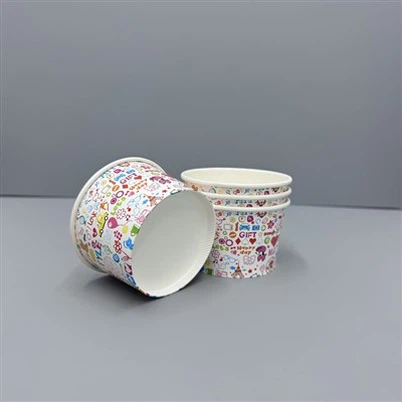
When you buy an ice cream cone today, you may notice something subtle: the packaging looks cleaner, simpler, and more elegant than before. The rise of ice cream cone paper sleeves with minimalist visuals is not just a passing style-it's a branding shift.
Minimalist ice cream cone paper sleeves are trending because they balance functionality, sustainability, and brand sophistication in one small piece of packaging.

I still remember when cone wrappers were crowded with heavy logos and bright patterns. But now, most café and dessert brands want to look modern. Simplicity, clean lines, and muted tones help customers focus on one thing-the ice cream itself. Let's explore why this minimalist design trend matters.
What Is Minimalism in Ice Cream Cone Sleeve Design?
Minimalism is not about "less effort." It is about clear purpose. In the world of ice cream cone paper sleeves, it means cutting away unnecessary elements while keeping strong visual identity.
A minimalist ice cream cone sleeve design uses simple forms, solid colors, and subtle branding to deliver elegance and function.

Dive Deeper: Simplicity That Serves a Purpose
Minimal aesthetics in packaging come from the same philosophy used in architecture and product design-every detail should serve a function. In ice cream cone paper sleeves, this means:
| Design Element | Purpose | Result |
|---|---|---|
| Solid color palette | Reduces distraction | Focuses attention on the product |
| Small, centered logo | Instantly recognizable | Strengthens brand recall |
| Matte texture | Prevents slipping | Feels premium |
| Eco paper finish | Sustainability appeal | Builds customer trust |
I've seen many brands create impactful impressions using only two colors and a small logo. It proves that clarity often beats complexity.
Why Are Ice Cream Cone Paper Sleeves Turning Minimalist?
Modern consumers are tired of clutter. They want authenticity, freshness, and design that feels natural.
Ice cream cone paper sleeves have become minimalist because consumers associate clean packaging with quality, honesty, and sustainability.
Dive Deeper: The Power of First Impressions
Packaging today is part of the brand's voice. Research shows that users perceive minimal packaging as more trustworthy. For paper ice cream cone sleeves, that means using:
Neutral backgrounds: beige, white, gray, or natural kraft brown.
Simple fonts: sans-serif, soft edges, easy to read.
Balanced white space: makes content breathable and elegant.
Customers subconsciously link white or earthy tones to purity and care. That emotional link often leads to stronger loyalty. A visually clean ice cream cone sleeve design can make your ice cream look healthier and more artisanal without changing the recipe.
How Does Sustainability Support the Minimalist Trend?
The packaging world is now ruled by eco-awareness. Many brands design for minimal visuals and minimal impact at once.
Minimalist ice cream cone paper sleeves often use uncoated kraft paper, soy-based ink, and zero-plastic finishes, aligning aesthetics with environmental values.

Dive Deeper: Materials That Speak Green
In the past, glossy plastic wrappers were common in ice cream retail. But as regulations grew stricter and customers more conscious, the shift toward recyclable or compostable materials accelerated. I've seen increasing demand for:
| Material | Feature | Eco-Level | Typical Finish |
|---|---|---|---|
| Kraft Paper | Natural look | High | Matte |
| FSC-Certified Paper | Traceable source | Very High | Smooth or textured |
| PLA-Coated Paper | Compostable lining | Medium | Soft shine |
These ice cream cone paper sleeves not only reduce waste but also visually communicate responsibility. The look of natural paper fiber tells customers your brand "walks the talk." Sustainable design is no longer a trend-it's consumer expectation.
How Does Minimalist Design Affect Brand Recognition?
Some fear that simple packaging loses uniqueness. The truth is, simplicity can make brands even more recognizable.
A minimal ice cream cone sleeve design highlights logo, color, and shape-turning every cone into a consistent brand statement.

Dive Deeper: Visual Consistency Across Stores
During my consulting projects with dessert shops, I've observed that brands using clean, repeated color codes (like pastel pink or kraft tone) build visual recall faster. Their paper ice cream cone wrappers become part of the total brand experience. This consistency applies no matter how small the outlet is.
| Branding Focus | Design Action | Customer Impact |
|---|---|---|
| Shape & Logo | Fixed geometry | Immediate recognition |
| Texture & Feel | Soft-touch finish | Sensory confidence |
| Color Consistency | Standard pantone | Familiarity & trust |
In short, the more consistent your ice cream cone paper sleeves look, the stronger your identity grows in the customer's memory.
Do Minimalist Ice Cream Cone Sleeves Improve Costs?
Yes, and this surprises many brand owners. Simpler artwork often results in lower production cost.
Reducing ink coverage, print passes, and color plates cuts costs while speeding up production for ice cream cone paper sleeves.
Dive Deeper: Balancing Aesthetics and Budget
Most suppliers charge per color or per print layer. When you simplify your design, you reduce all of that. This doesn't mean sacrificing visual appeal-it means designing smarter.
A premium feel can still come from other choices like paper gram weight, embossing, or special folding shapes. Many cafés upgrade to thicker paper ice cream cone sleeves while keeping the exterior design plain, achieving both luxury and cost control.
| Feature | Cost Impact | Note |
|---|---|---|
| Full-color print | High | Good for seasonal designs |
| 1–2 color prints | Low | Ideal for minimalist branding |
| Natural paper tone | No ink needed | Reduces waste and ink cost |
Smart simplicity benefits both the environment and your business's bottom line.
What's Next for Ice Cream Cone Paper Sleeve Trends?
Brands are now merging minimalism with storytelling. Instead of graphic clutter, they use meaningful lines, local symbols, or short brand phrases.
The future of ice cream cone paper sleeves will be about emotional connection-showing brand ethics in a clean, artistic way.

Dive Deeper: Subtle Details That Engage
Future designs may include QR codes hidden in small icons or embossed text showing origin. Consumers can scan to read sustainability efforts or product stories. These soft details keep the minimalist tone but add interaction.
Also, digital printing now allows short-run customization. With this, cafés can test different ice cream cone sleeve design versions before launching nationwide. The mix of texture, minimal print, and storytelling will redefine what "premium" means in this space.
Conclusion
Minimalism in ice cream cone paper sleeves is not just a style-it's a statement of purity, sustainability, and authenticity. Brands that adopt it signal honesty and care in every detail.
If you're ready to design your own modern and sustainable packaging, contact Haokelao Packaging-we help translate simplicity into visual power that customers can feel in every cone.
工具介绍