Seasonal Ice Cream Cone Sleeve Designs to Try
Leave a message
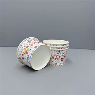
Every season tells a different story, and your ice cream cone sleeve design can be the simplest way to express it. When a customer holds a cone, they are not only tasting the flavor-they are also reading your brand through the texture, color, and message printed on its sleeve.
A well-crafted ice cream cone sleeve design can reflect the mood of the season, enhance visual appeal, and make your product instantly recognizable in a crowded market.
As an expert in eco-friendly paper packaging, I've seen how even small design choices-like sleeve patterns or finishes-can spark excitement. Each season brings a new design opportunity to connect with people emotionally and visually. Let's explore creative ideas for paper ice cream cone sleeves that help your brand stay fresh all year round.
1. How Can Spring Inspire a Fresh Ice Cream Cone Sleeve Design?
Spring always feels like a breath of clean air. It brings renewal, and that same feeling should show in your packaging. Pastel tones, subtle florals, or simple line art can align perfectly with the season's gentle aesthetic.
In spring, light color palettes and delicate graphics make your ice cream cone sleeve design feel fresh, joyful, and full of life.

Spring-themed sleeves often use paper with a soft matte texture or slight embossing to mimic the softness of nature. Small touches like mint green or pale yellow add brightness without feeling noisy.
Dive Deeper: The Psychology of Spring Colors in Packaging
Spring colors evoke freshness and optimism. Pairing a pale background with floral outlines printed in one or two ink tones keeps printing costs efficient while maintaining elegance. When choosing paper ice cream cone sleeves, FSC-certified pastel kraft options signal sustainability and charm at the same time.
| Color Scheme | Feeling It Creates | Ideal Application |
|---|---|---|
| Mint + White | Fresh, Pure | Frozen yogurt or fruit-based cones |
| Lavender + Cream | Calm, Soft | Dairy-free or premium flavors |
| Light Yellow + Beige | Warm, Natural | Small artisanal shops |
The key to a good spring ice cream cone sleeve design is keeping balance-fresh but not flashy, delicate yet memorable.
2. What Makes Summer Ice Cream Cone Paper Sleeves So Eye-Catching?
Summer is the time when ice cream sales peak. Every detail of your sleeve matters because it becomes a major part of the customer experience.
Summer ice cream cone sleeve design works best with bright tones, bold typography, and fun illustrations that match the energy of the season.

Playful patterns like waves, fruits, or abstract splashes make your sleeves stand out. However, clarity should remain your focus-simple shapes communicate more effectively than overly complex imagery.
Dive Deeper: Designing for Vibrancy and Comfort in Hot Weather
In hot conditions, hands often get sticky, so sleeve materials should have slight grip or moisture resistance. Bio-coated paper or double-layer paper ice cream cone sleeves help manage this. Colors like aqua blue, coral, or lime green connect visually with tropical moods.
| Design Aspect | Benefit | Material Suggestion |
|---|---|---|
| Gloss Finish | Reflects sunlight, modern appeal | PLA-coated paper |
| Minimal Fruit Icons | Refreshing and seasonal | Compostable paper base |
| Bold Font on Simple Base | Improves visibility | Matte kraft |
Summer is about clarity and bold expression. A bright, clean ice cream cone sleeve design can turn each cone into a moving advertisement.
3. How Should Autumn Ice Cream Cone Sleeve Designs Feel?
Autumn whispers sophistication. It's the season of cozy colors and organic textures.
Autumn ice cream cone sleeve design ideas often feature earthy tones, natural patterns, and tactile finishes that communicate warmth and authenticity.

The autumn palette-browns, reds, and golds-works beautifully on kraft paper. When paired with a textured logo or foil accent, your sleeve can look premium yet grounded.
Dive Deeper: Texture and Tone for Seasonal Connection
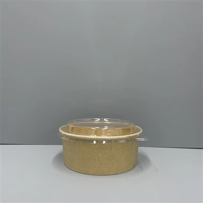
Autumn packaging design benefits from minimal line work, diagonal plaid, or woodgrain effects. For flexibility, paper ice cream cone wrappers can carry interchangeable labels identifying seasonal flavors, reducing waste. Many brands now use unbleached kraft paper for autumn editions-it offers sturdy structure, recyclable properties, and a natural touch.
| Color Texture | Meaning | Perfect For |
|---|---|---|
| Matte Kraft + Gold Foil | Luxury with warmth | Premium gelato lines |
| Deep Red + Brown Ink | Tradition, comfort | Cinnamon or pumpkin varieties |
| Embossed Texture | Handmade feel | Local cafés |
Using texture strategically can enhance emotional connection and make your ice cream cone paper sleeves instantly feel more special.
4. What Defines a Winter Ice Cream Cone Sleeve Design?
Winter sleeve design should communicate comfort and clarity. People crave calm and warmth during the cold season.
The best winter ice cream cone sleeve design blends cool tones with minimalist icons-snowflakes, cups of cocoa, or subtle metallic prints-that reflect the chilled atmosphere of the season.

Blue-gray bases, white graphics, and minimal typography create a peaceful, modern appearance. A foil print or silver outline evokes a festive touch without looking too busy.
Dive Deeper: Achieving Winter's Minimal Luxury
Metallic details on recyclable paper sleeves build a sense of celebration while keeping production eco-friendly. Using thicker paper prevents sogginess from temperature differences. Paper ice cream cone wrappers with matte or slightly embossed finishes also help improve grip in cold hands.
| Design Element | Function | Visual Effect |
|---|---|---|
| Silver Foil on Blue | Adds shine | Feels festive |
| Minimal Snowflake Icon | Symbolic, light-hearted | Enhances winter theme |
| Layered Paper Structure | Keeps temperature stable | Comfort in hand |
Minimal winter designs remind buyers that freshness and calm can go hand in hand. An elegant ice cream cone sleeve design during winter also increases brand perception and perceived product value.
5. How Can You Plan for Year-Round Consistency Across Seasons?
Seasonal creativity must still fit within a consistent brand identity. Without guidelines, your packaging can look disjointed over time.
Maintaining shared visual elements-like your logo placement, color logic, or material quality-helps every seasonal ice cream cone sleeve design feel part of one bigger story.
When planning for paper ice cream cone sleeves, work from a core template and adapt the visuals each season. This keeps production efficient while giving your brand fresh seasonal expression.
Dive Deeper: Building a Cohesive Seasonal Design Strategy
Start by identifying which parts of the design never change-like logo, QR code, or typography. Then, test variations in colors or textures based on season. Using modular design for paper ice cream cone wrappers ensures your visual identity grows with your brand, not away from it.
| Strategy | What to Keep | What to Adjust |
|---|---|---|
| Design Template | Logo placement, typography | Color palette |
| Material Choice | Same FSC-certified base | Seasonal finish |
| Message Tone | Brand slogan | Seasonal tagline |
Careful planning guarantees your ice cream cone sleeve design stays consistent but never repetitive. Customers value familiarity with freshness.
Conclusion
A well-thought-out ice cream cone sleeve design brings flavor and story together. Every season-spring, summer, autumn, and winter-offers opportunities to express your brand through shape, texture, and emotion. At Haokelao Packaging, we help transform these creative ideas into sustainable, high-quality paper ice cream cone sleeves that bring beauty, comfort, and meaning to every scoop.