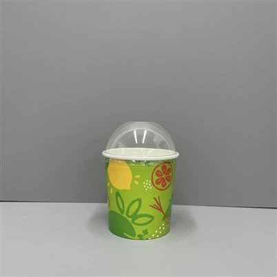

How to Make Your Ice Cream Paper Cups Stand Out with Creative Designs?
Leave a message
Everyone sells ice cream, but not everyone gets noticed. Most brands look the same, and customers just pick whatever is closest to them.
To make your ice cream paper cups stand out, combine design, material, and printing choices that reflect your brand and attract attention at first sight.

The way an ice cream paper cup looks can change how people feel about your product. Today's customers care about design, not only taste. So how can your cups speak for your brand? Let's explore that together.
Why Does Cup Design Matter So Much?
When a customer buys ice cream, they also buy a feeling. A boring cup shows no effort, but a creative one tells a story. People share what looks good.
Cup design matters because it builds your visual identity, influences first impressions, and helps customers remember your brand over time.

Your ice cream paper cups are both packaging and presentation. The first look sets expectations. Consistency across your custom ice cream cups makes your brand familiar. Color, logo, and typography all play a role. Plain packaging blends in; creative packaging stands out.
How Color Affects Perception?
Colors set emotions. Choose hues that match your flavor or brand tone. For example:
| Color | Emotion It Creates | Best Used For |
|---|---|---|
| Blue | Calm, Fresh | Frozen yogurt, blueberry ice cream |
| Yellow | Energy, Joy | Tropical or summer flavors |
| Pastel Pink | Sweetness, Comfort | Kids or family-friendly brands |
| Brown | Warmth, Quality | Premium chocolate or coffee ice cream |
A clever use of color makes customers feel your flavor before they even taste it. It goes beyond decoration-it's communication.
How Can You Align Design With Your Brand Story?
Customers like stories. They want to know who made their ice cream and what that story means. Design helps you tell that story in a small but powerful way.
Aligning your cup design with your brand story makes your product memorable, instantly recognizable, and more shareable online.

Every business has something unique. Maybe you use local ingredients. Maybe your shop is about fun and family. Or maybe your message is eco-living. Reflect that in design. Use icons, colors, or even small patterns that represent that idea. When I designed my first line of paper ice cream cups, the goal was simple: communicate freshness and care through soft colors and recycled materials.
Small Elements That Create Big Impact
| Element | Purpose | Example |
|---|---|---|
| Logo placement | Builds recognition | Place on both front and lid |
| Tagline | Reinforces brand value | "Scoop of Happiness" |
| Texture | Adds tactile quality | Matte surface with embossed logo |
| QR Code | Engages customers | Linked to your brand story page |
I found that customers notice even the smallest detail-the texture of the lid, the smoothness of the print. Each choice should express your care and values.
What Printing and Material Options Work Best?
Even the smartest design can fail if printed poorly. The printing process and materials matter because they define how colors appear and how eco-friendly the product remains.
Choose printing and material options that preserve color quality, ensure stability, and match your brand's sustainability goals.
The main structure of ice cream paper cups is usually food-grade paper with a coated layer. Some use traditional PE coating, others eco-friendly PLA. Both protect the cup from melting or leakage, but PLA is biodegradable, which fits most modern brands' sustainability values.
| Type | Benefits | Limitations |
|---|---|---|
| PE coated paper | Strong barrier against liquid | Not easily recyclable |
| PLA coated paper | Compostable and plant-based | Slightly higher cost |
| Uncoated paper with liner | Natural look, recyclable | May need double wall for insulation |
For printing, flexographic and offset printing are most common. Digital printing suits small runs and custom ideas. I once worked with a brand that wanted vivid fruit patterns-using UV-offset printing made those details more vibrant and premium-looking.
How to Design for Both Function and Aesthetics?
Good design balances beauty and function. Customers love cups that look great, but they also expect comfort and performance. Function is part of design.
Design your cups to be both visually attractive and user-friendly, ensuring they are easy to hold, stack, and serve ice cream safely.

Sometimes, the ideal custom ice cream cups design is not about more decoration but smarter structure. For example, double-wall paper cups protect hands from cold. Textured surfaces improve grip. The lid design also affects presentation-transparent lids show the product clearly, inviting instant appetite appeal.
Making Function Serve Design
| Area | Design Direction | Why It Matters |
|---|---|---|
| Grip | Slight texture or ridges | Prevents slipping |
| Size variation | 4oz, 8oz, 12oz options | Fits different serving needs |
| Lid design | Clear or dome | Attracts customers visually |
| Branding zone | Central, clean area | Improves logo visibility |
As a manufacturer, I often remind clients that the simplest shapes are usually the most reliable in production and stacking. A clean, strong cup design builds trust in both retail and catering use.
Conclusion
Your ice cream paper cups are not just containers-they are silent marketers. A thoughtful design connects product, story, and customer experience. Great cups turn first-time buyers into loyal fans.
At Haokelao Packaging, we help brands create eco-friendly, creative, and premium custom ice cream cups that truly stand out.